5  Reliability and accuracy

6 Severity data

6.1 Terminology

Disease severity, mainly when expressed in percent area diseased assessed visually, is acknowledged as a more difficult and less time- and cost-effective plant disease variable to obtain. However, errors may occur even when assessing a more objective measure such as incidence. This is the case when an incorrect assignment or confusion of symptoms occur. In either case, the quality of the assessment of any disease variable is very important and should be gauged in the studies. Several terms can be used when evaluating the quality of disease assessments, including reliability, precision, accuracy or agreement.

Reliability: The extent to which the same estimates or measurements of diseased specimens obtained under different conditions yield similar results. There are two types. The inter-rater reliability (or reproducibility) is a measure of consistency of disease assessment across the same specimens between raters or devices. The intra-rater reliability (or repeatability) measures consistency by the same rater or instrument on the same specimens (e.g. two assessments in time by the same rater).

Figure 6.1: Two types of reliability of estimates or measures of plant disease intensity

Precision: A statistical term to express the measure of variability of the estimates or measurements of disease on the same specimens obtained by different raters (or instruments). However, reliable or precise estimates (or measurements) are not necessarily close to an actual value, but precision is a component of accuracy or agreement.

Accuracy or agreement: These two terms can be treated as synonymous in plant pathological research. They refer to the closeness (or concordance) of an estimate or measurement to the actual severity value for a specimen on the same scale. Actual values may be obtained using various methods, against which estimates or measurements using an experimental assessment method are compared.

An analogy commonly used to explain accuracy and precision is the archer shooting arrows at a target and trying to hit the bull’s eye (center of the target) with each of five arrows. The figure below is used to demonstrate four situations from the combination of two levels (high and low) for precision and accuracy. The figure was produced using the ggplot function of ggplot2 package.

Code
library(ggplot2)
target <- 
  ggplot(data.frame(c(1:10),c(1:10)))+
  geom_point(aes(x = 5, y = 5), size = 71.5, color = "black")+
  geom_point(aes(x = 5, y = 5), size = 70, color = "#99cc66")+
  geom_point(aes(x = 5, y = 5), size = 60, color = "white")+
  geom_point(aes(x = 5, y = 5), size = 50, color = "#99cc66")+
  geom_point(aes(x = 5, y = 5), size = 40, color = "white")+
  geom_point(aes(x = 5, y = 5), size = 30, color = "#99cc66")+
  geom_point(aes(x = 5, y = 5), size = 20, color = "white")+
  geom_point(aes(x = 5, y = 5), size = 10, color = "#99cc66")+
  geom_point(aes(x = 5, y = 5), size = 4, color = "white")+
  ylim(0,10)+
  xlim(0,10)+
  theme_void()

hahp <- target +
  labs(subtitle = "High Accuracy High Precision")+
  theme(plot.subtitle = element_text(hjust = 0.5))+
  geom_point(aes(x = 5, y = 5), shape = 4, size =2, color = "blue")+
  geom_point(aes(x = 5, y = 5.2), shape = 4, size =2, color = "blue")+
  geom_point(aes(x = 5, y = 4.8), shape = 4, size =2, color = "blue")+
  geom_point(aes(x = 4.8, y = 5), shape = 4, size =2, color = "blue")+
  geom_point(aes(x = 5.2, y = 5), shape = 4, size =2, color = "blue")


lahp <- target +
  labs(subtitle = "Low Accuracy High Precision")+
  theme(plot.subtitle = element_text(hjust = 0.5))+
  geom_point(aes(x = 6, y = 6), shape = 4, size =2, color = "blue")+
  geom_point(aes(x = 6, y = 6.2), shape = 4, size =2, color = "blue")+
  geom_point(aes(x = 6, y = 5.8), shape = 4, size =2, color = "blue")+
  geom_point(aes(x = 5.8, y = 6), shape = 4, size =2, color = "blue")+
  geom_point(aes(x = 6.2, y = 6), shape = 4, size =2, color = "blue")


halp <- target +
  labs(subtitle = "High Accuracy Low Precision")+
  theme(plot.subtitle = element_text(hjust = 0.5))+
  geom_point(aes(x = 5, y = 5), shape = 4, size =2, color = "blue")+
  geom_point(aes(x = 5, y = 5.8), shape = 4, size =2, color = "blue")+
  geom_point(aes(x = 5.8, y = 4.4), shape = 4, size =2, color = "blue")+
  geom_point(aes(x = 4.4, y = 5), shape = 4, size =2, color = "blue")+
  geom_point(aes(x = 5.6, y = 5.6), shape = 4, size =2, color = "blue")

lalp <- target +
  labs(subtitle = "Low Accuracy Low Precision")+
  theme(plot.subtitle = element_text(hjust = 0.5))+
  geom_point(aes(x = 5.5, y = 5.5), shape = 4, size =2, color = "blue")+
  geom_point(aes(x = 4.5, y = 5.4), shape = 4, size =2, color = "blue")+
  geom_point(aes(x = 5.2, y = 6.8), shape = 4, size =2, color = "blue")+
  geom_point(aes(x = 4.8, y = 3.8), shape = 4, size =2, color = "blue")+
  geom_point(aes(x = 5.2, y = 3), shape = 4, size =2, color = "blue")


library(patchwork)
(hahp | lahp) /
(halp | lalp)
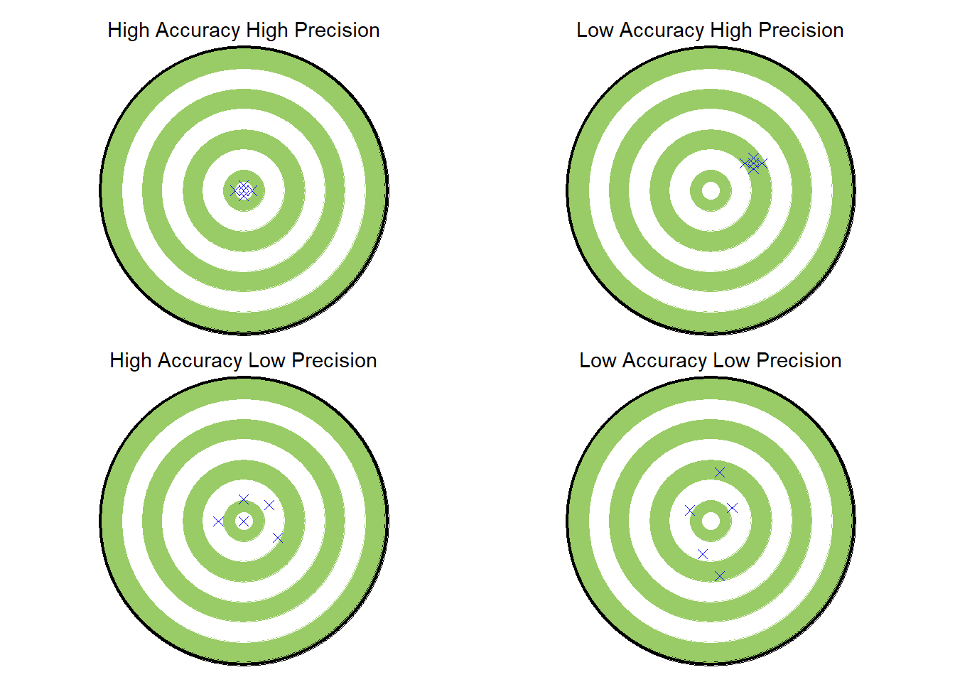
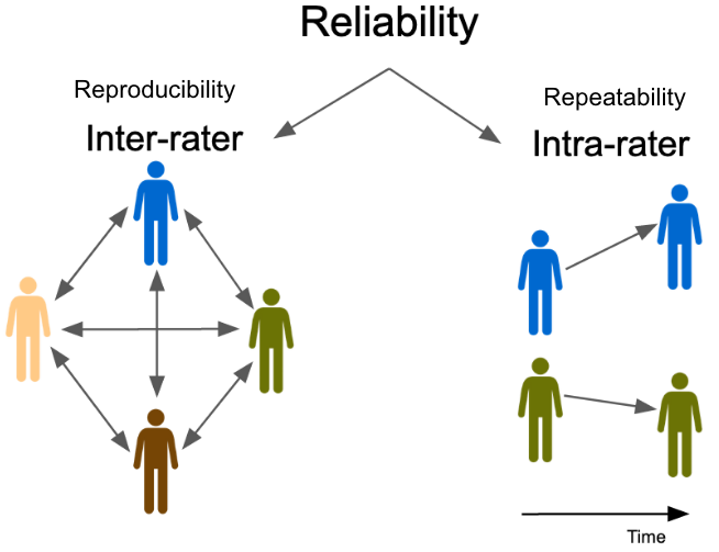
Figure 6.2: The accuracy and precision of the archer is determined by the location of the group of arrows

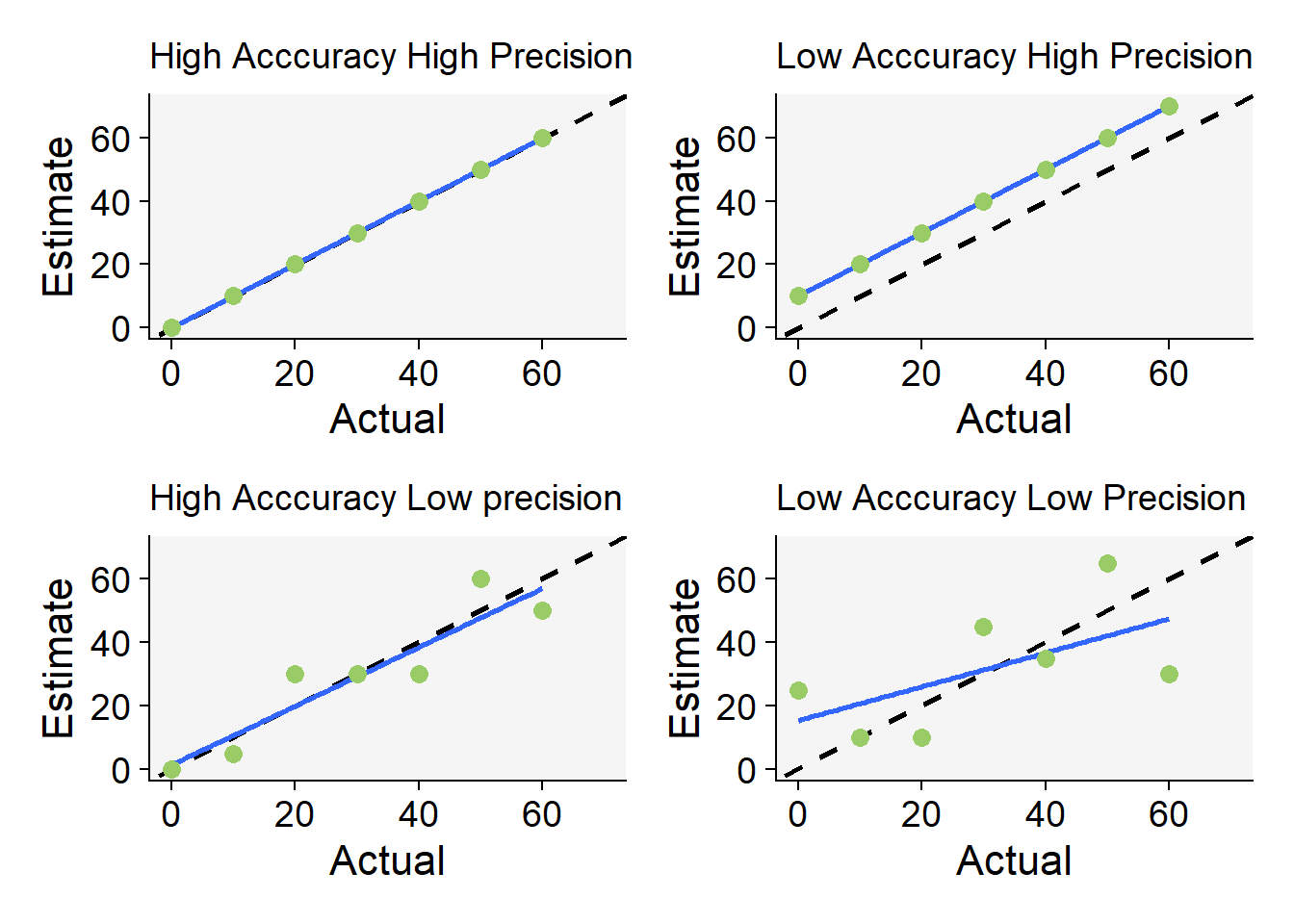
Another way to visualize accuracy and precision is via scatter plots for the relationship between the actual values and the estimates.

Code
library(tidyverse)
library(r4pde)
theme_set(theme_r4pde())
dat <- 
tibble::tribble(
  ~actual,   ~ap,   ~ip,   ~ai,   ~ii,
        0,     0,    10,     0,    25,
       10,    10,    20,     5,    10,
       20,    20,    30,    30,    10,
       30,    30,    40,    30,    45,
       40,    40,    50,    30,    35,
       50,    50,    60,    60,    65,
       60,    60,    70,    50,    30
  )

ap <- dat |> 
  ggplot(aes(actual, ap))+
  geom_abline(intercept = 0, slope = 1, 
              linetype = 2, size = 1)+
    geom_smooth(method = "lm")+
   geom_point(color = "#99cc66", size = 3)+
   ylim(0,70)+
  xlim(0,70)+
  labs(x = "Actual", y = "Estimate",
       subtitle = "High Acccuracy High Precision")

ip <- dat |> 
  ggplot(aes(actual, ip))+
  geom_abline(intercept = 0, slope = 1, 
              linetype = 2, size = 1)+
  geom_smooth(method = "lm", se = F)+
  geom_point(color = "#99cc66", size = 3)+
  ylim(0,70)+
  xlim(0,70)+
  labs(x = "Actual", y = "Estimate",
       subtitle = "Low Acccuracy High Precision")

ai <- dat |> 
  ggplot(aes(actual, ai))+
  geom_abline(intercept = 0, slope = 1, 
              linetype = 2, size = 1)+
  geom_smooth(method = "lm", se = F)+
  geom_point(color = "#99cc66", size = 3)+
  ylim(0,70)+
  xlim(0,70)+
  labs(x = "Actual", y = "Estimate",
       subtitle = "High Acccuracy Low precision")

ii <- dat |> 
  ggplot(aes(actual, ii))+
  geom_abline(intercept = 0, slope = 1, 
              linetype = 2, size = 1)+
  geom_smooth(method = "lm", se = F)+
  geom_point(color = "#99cc66", size = 3)+
  ylim(0,70)+
  xlim(0,70)+
  labs(x = "Actual", y = "Estimate",
       subtitle = "Low Acccuracy Low Precision")

library(patchwork)
(ap | ip) / (ai | ii)
Figure 6.3: Scatter plots for the relationship between actual and estimated values representing situations of low or high precision and accuracy. The dashed line indicates the perfect concordance and the solid blue line represents the fit of the linear regression model

6.2 Statistical summaries

A formal assessment of the quality of estimates or measures is made using statistical summaries of the data expressed as indices that represent reliability, precision and accuracy. These indices can further be used to test hypothesis such as if one or another method is superior than the other. The indices or the tests vary according to the nature of the variable, whether continuous, binary or categorical.

6.2.1 Inter-rater reliability

To calculate measures of inter-rater reliability (or reproducibility) we will work with a fraction of a larger dataset used in a published study. There, the authors tested the effect of standard area diagrams (SADs) on the reliability and accuracy of visual estimates of severity of soybean rust.

The selected dataset consists of five columns with 20 rows. The first is the leaf number and the others correspond to assessments of percent soybean rust severity by four raters (R1 to R4). Each row correspond to one symptomatic leaf. Let’s assign the tibble to a dataframe called sbr (an acronym for soybean rust). Note that the variable is continuous.

library(tidyverse)
sbr <- tribble(
~leaf, ~R1, ~R2,  ~R3, ~R4,
1, 0.6, 0.6,  0.7, 0.6,
2,   2, 0.7,    5,   1,
3,   5,   5,    8,   5,
4,   2,   4,    6,   2,
5,   6,  14,   10,   7,
6,   5,   6,   10,   5,
7,  10,  18, 12.5,  12,
8,  15,  30,   22,  10,
9,   7,   2,   12,   8,
10,  6,   9, 11.5,   8,
11,  7,   7,   20,   9,
12,  6,  23,   22,  14,
13, 10,  35, 18.5,  20,
14, 19,  10,    9,  10,
15, 15,  20,   19,  20,
16, 17,  30,   18,  13,
17, 19,  53,   33,  38,
18, 17, 6.8,   15,   9,
19, 15,  20,   18,  16,
20, 18,  22,   24,  15
         )

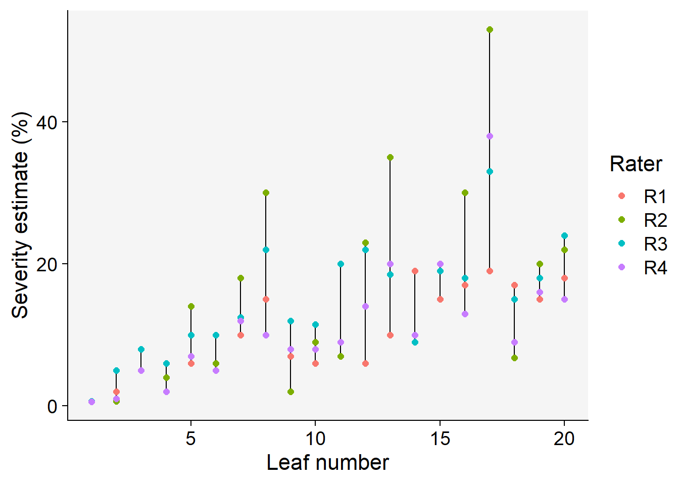
Let’s explore the data using various approaches. First, we can visualize how the individual estimates by the raters differ for a same leaf.

# transform from wide to long format
sbr2 <- sbr |> 
  pivot_longer(2:5, names_to = "rater",
               values_to = "estimate") 

# create the plot
sbr2 |> 
  ggplot(aes(leaf, estimate, color = rater,
             group = leaf))+
  geom_line(color = "black")+
  geom_point(size = 2)+
  labs(y = "Severity estimate (%)",
       x = "Leaf number",
       color = "Rater")
Figure 6.4: Visual estimates of soybean rust severity for each leaf by each of four raters

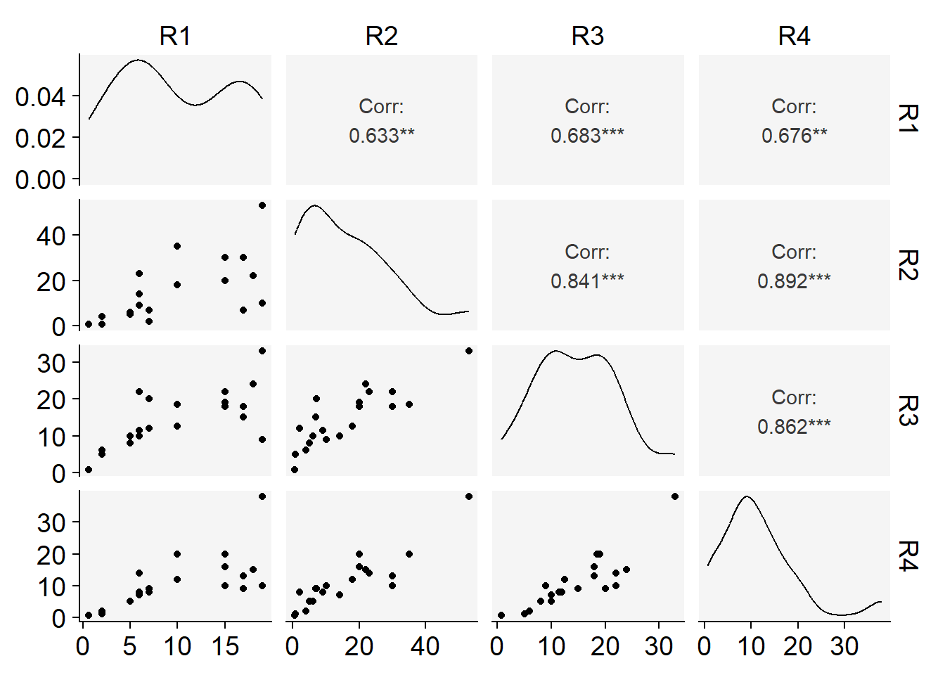
Another interesting visualization is the correlation matrix of the estimates between all possible pair of raters. The ggpairs function of the GGally package is handy for this task.

library(GGally)


# create a new dataframe with only raters
raters <- sbr |> 
  select(2:5)

ggpairs(raters)+
  theme_r4pde()
Figure 6.5: Correlation plots relating severity estimates for all pairs of raters

6.2.1.1 Coefficient of determination

We noticed earlier that the correlation coefficients varied across all pairs of rater. Sometimes, the means of squared Pearson’s R values (R2), or the coefficient of determination is used as a measure of inter-rater reliability. We can further examine the pair-wise correlations in more details using the cor function,

knitr::kable(cor(raters))
Table 6.1: Pearson correlation coefficients for all pairs of raters
R1 R2 R3 R4
R1 1.0000000 0.6325037 0.6825936 0.6756986
R2 0.6325037 1.0000000 0.8413333 0.8922181
R3 0.6825936 0.8413333 1.0000000 0.8615470
R4 0.6756986 0.8922181 0.8615470 1.0000000

The means of coefficient of determination can be easily obtained as follows.

# All pairwise R2

raters_cor <- reshape2::melt(cor(raters))

raters2 <- raters_cor |> 
  filter(value != 1) 

# means of R2
raters2$value
 [1] 0.6325037 0.6825936 0.6756986 0.6325037 0.8413333 0.8922181 0.6825936
 [8] 0.8413333 0.8615470 0.6756986 0.8922181 0.8615470
round(mean(raters2$value^2), 3)
[1] 0.595

6.2.1.2 Intraclass Correlation Coefficient

A common statistic to report in reliability studies is the Intraclass Correlation Coefficient (ICC). There are several formulations for the ICC whose choice depend on the particular experimental design. Following the convention of the seminal work by Shrout and Fleiss (1979), there are three main ICCs:

  • One-way random effects model, ICC(1,1): in our context, each leaf is rated by different raters who are considered as sampled from a larger pool of raters (random effects)

  • Two-way random effects model, ICC(2,1): both raters and leaves are viewed as random effects

  • Two-way mixed model, ICC(3,1): raters are considered as fixed effects and leaves are considered as random.

Additionally, the ICC may depend on whether the ratings are an average or not of several ratings. When an average is considered, these are called ICC(1,k), ICC(2,k) and ICC(3,k).

The ICC can be computed using the ICC() or the icc() functions of the psych or irr packages, respectively. They both provide the coefficient, F value, and the upper and lower bounds of the 95% confidence interval.

library(psych)
ic <- ICC(raters)
knitr::kable(ic$results[1:2]) # only selected columns
type ICC
Single_raters_absolute ICC1 0.6405024
Single_random_raters ICC2 0.6464122
Single_fixed_raters ICC3 0.6919099
Average_raters_absolute ICC1k 0.8769479
Average_random_raters ICC2k 0.8797008
Average_fixed_raters ICC3k 0.8998319
# call ic list for full results

The output of interest is a dataframe with the results of all distinct ICCs. We note that the ICC1 and ICC2 gave very close results. Now, let’s obtain the various ICCs using the irr package. Differently from the the ICC() function, this one requires further specification of the model to use.

library(irr)
icc(raters, "oneway")
 Single Score Intraclass Correlation

   Model: oneway 
   Type : consistency 

   Subjects = 20 
     Raters = 4 
     ICC(1) = 0.641

 F-Test, H0: r0 = 0 ; H1: r0 > 0 
   F(19,60) = 8.13 , p = 1.8e-10 

 95%-Confidence Interval for ICC Population Values:
  0.44 < ICC < 0.813
# The one used in the SBR paper
icc(raters, "twoway")
 Single Score Intraclass Correlation

   Model: twoway 
   Type : consistency 

   Subjects = 20 
     Raters = 4 
   ICC(C,1) = 0.692

 F-Test, H0: r0 = 0 ; H1: r0 > 0 
   F(19,57) = 9.98 , p = 6.08e-12 

 95%-Confidence Interval for ICC Population Values:
  0.503 < ICC < 0.845

6.2.1.3 Overall Concordance Correlation Coefficient

Another useful index is the Overall Concordance Correlation Coefficient (OCCC) for evaluating agreement among multiple observers. It was proposed by Barnhart et al. (2002) based on the original index proposed by Lin (1989), earlier defined in the context of two fixed observers. In the paper, the authors introduced the OCCC in terms of the interobserver variability for assessing agreement among multiple fixed observers. As outcome, and similar to the original CCC, the approach addresses the precision and accuracy indices as components of the OCCC. The epi.occc function of the epiR packge does the job but it does compute a confidence interval.

library(epiR)
epi.occc(raters, na.rm = FALSE, pairs = TRUE)

Overall CCC           0.6372
Overall precision     0.7843
Overall accuracy      0.8125

6.2.2 Intrarater reliability

As defined, the intrarater reliability is also known as repeatability, because it measures consistency by the same rater at repeated assessments (e.g. different times) on the same sample. In some studies, we may be interested in testing whether a new method increases repeatability of assessments by a single rater compared with another one. The same indices used for assessing reproducibility (interrater) can be used to assess repeatability, and these are reported at the rater level.

6.2.3 Precision

When assessing precision, one measures the variability of the estimates (or measurements) of disease on the same sampling units obtained by different raters (or instruments). A very high precision does not mean that the estimates are closer to the actual value (which is given by measures of bias). However, precision is a component of overall accuracy, or agreement. It is given by the Pearson’s correlation coefficient.

Different from reliability, that requires only the estimates or measures by the raters, now we need a reference (gold standard) value to compare the estimates to. These can be an accurate rater or measures by an instrument. Let’s get back to the soybean rust severity estimation dataset and add a column for the (assumed) actual values of severity on each leaf. In that work, the actual severity values were obtained using image analysis.

sbr <- tibble::tribble(
~leaf, ~actual, ~R1, ~R2,  ~R3, ~R4,
1,    0.25, 0.6, 0.6,  0.7, 0.6,
2,     2.5,   2, 0.7,    5,   1,
3,    7.24,   5,   5,    8,   5,
4,    7.31,   2,   4,    6,   2,
5,    9.07,   6,  14,   10,   7,
6,    11.6,   5,   6,   10,   5,
7,   12.46,  10,  18, 12.5,  12,
8,    13.1,  15,  30,   22,  10,
9,   14.61,   7,   2,   12,   8,
10,  16.06,   6,   9, 11.5,   8,
11,   16.7,   7,   7,   20,   9,
12,   19.5,   6,  23,   22,  14,
13,  20.75,  10,  35, 18.5,  20,
14,  23.56,  19,  10,    9,  10,
15,  23.77,  15,  20,   19,  20,
16,  24.45,  17,  30,   18,  13,
17,  25.78,  19,  53,   33,  38,
18,  26.03,  17, 6.8,   15,   9,
19,  26.42,  15,  20,   18,  16,
20,  28.89,  18,  22,   24,  15
         )

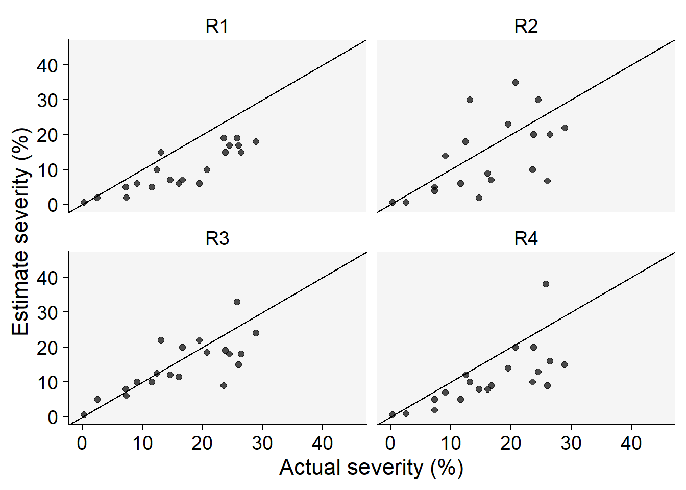
We can explore visually via scatter plots the relationships between the actual value and the estimates by each rater (Figure 6.6). To facilitate, we need the data in the long format.

sbr2 <- sbr |> 
  pivot_longer(3:6, names_to = "rater",
               values_to = "estimate") 

sbr2 |> 
  ggplot(aes(actual, estimate))+
  geom_point(size = 2, alpha = 0.7)+
  facet_wrap(~rater)+
  ylim(0,45)+
  xlim(0,45)+
  geom_abline(intercept = 0, slope =1)+
  theme_r4pde()+
  labs(x = "Actual severity (%)",
       y = "Estimate severity (%)")
Figure 6.6: Scatterplots for the relationship between estimated and actual severity for each rater

The Pearson’s r for the relationship, or the precision of the estimates by each rater, can be obtained using the correlation function of the correlation package.

precision <- sbr2 |> 
  select(-leaf) |> 
  group_by(rater) |> 
  correlation::correlation() 

knitr::kable(precision[1:4])
Group Parameter1 Parameter2 r
R1 actual estimate 0.8725643
R2 actual estimate 0.5845291
R3 actual estimate 0.7531983
R4 actual estimate 0.7108260

The mean precision can then be obtained.

mean(precision$r)
[1] 0.7302795

6.2.4 Accuracy

6.2.4.1 Absolute errors

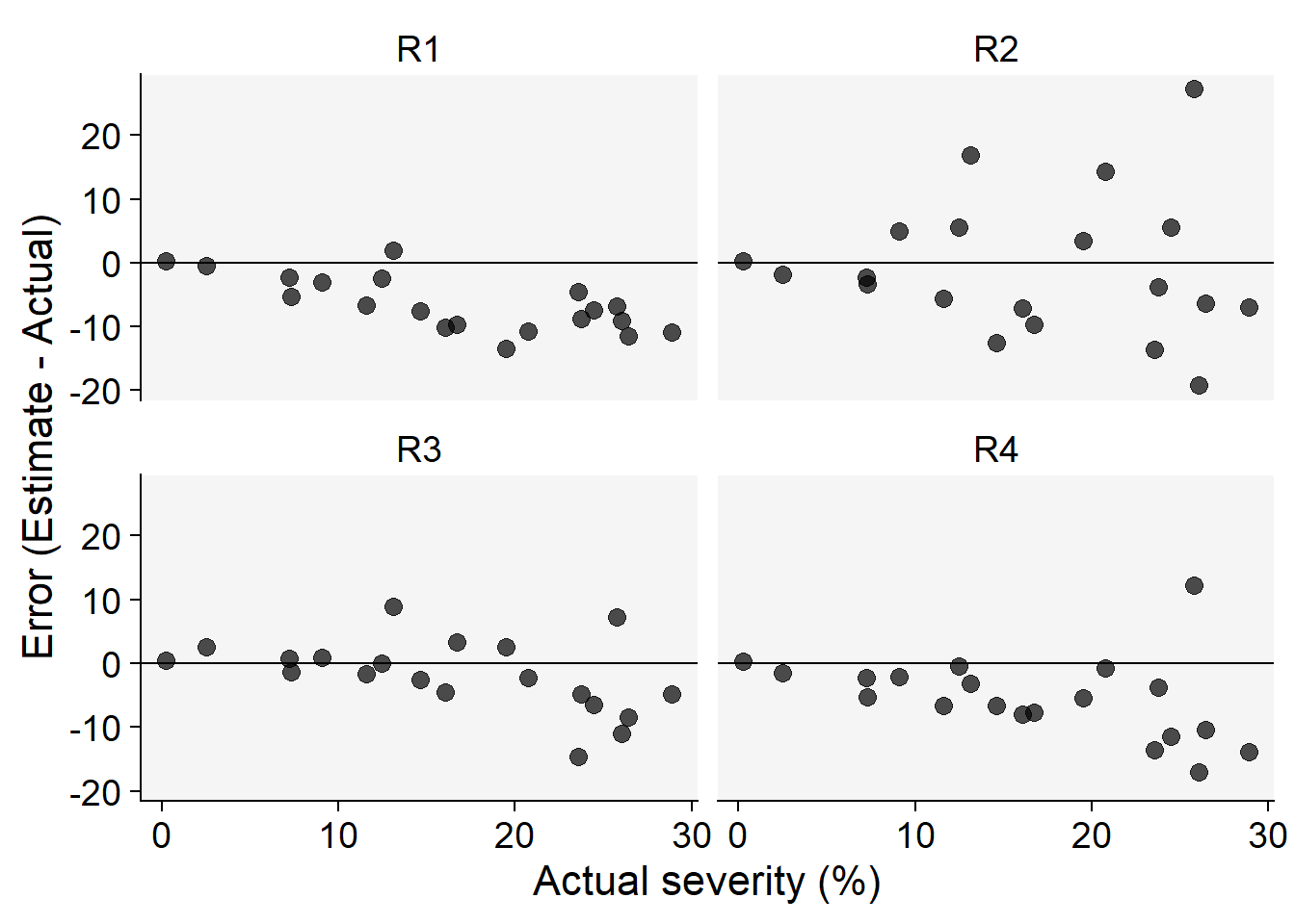
It is useful to visualize the errors of the estimates which are obtained by subtracting the estimates from the actual severity values. This plot allows to visualize patterns in over or underestimations across a range of actual severity values.

sbr2 |> 
  ggplot(aes(actual, estimate-actual))+
  geom_point(size = 3, alpha = 0.7)+
  facet_wrap(~rater)+
  geom_hline(yintercept = 0)+
  theme_r4pde()+
  labs(x = "Actual severity (%)",
       y = "Error (Estimate - Actual)")
Figure 6.7: Error (estimated - actual) of visual severity estimates

6.2.4.2 Concordance correlation coefficient

Lin’s (1989, 2000) proposed the concordance correlation coefficient (CCC) for agreement on a continuous measure obtained by two methods. The CCC combines measures of both precision and accuracy to determine how far the observed data deviate from the line of perfect concordance. Lin’s CCC increases in value as a function of the nearness of the data reduced major axis to the line of perfect concordance (the accuracy of the data) and of the tightness of the data about its reduced major axis (the precision of the data).

The epi.ccc function of the epiR package allows to obtain the Lin’s CCC statistics. Let’s filter only rater 2 and calculate the CCC statistics for this rater.

library(epiR)
# Only rater 2
sbr3 <- sbr2 |> filter(rater == "R2")
ccc <- epi.ccc(sbr3$actual, sbr3$estimate)
# Concordance coefficient
rho <- ccc$rho.c[,1]
# Bias coefficient
Cb <- ccc$C.b
# Precision
r <- ccc$C.b*ccc$rho.c[,1]
# Scale-shift
ss <- ccc$s.shift
# Location-shift
ls <- ccc$l.shift
Metrics <- c("Agreement", "Bias coefficient", "Precision", "scale-shift", "location-shift")
Value <- c(rho, Cb, r, ss, ls)
res <- data.frame(Metrics, Value)
knitr::kable(res)
Table 6.2: Statitics of the concordance correlation coefficient summarizing accuracy and precision of visual severity estimates of soybean rust for a single rater
Metrics Value
Agreement 0.5230656
Bias coefficient 0.8948494
Precision 0.4680649
scale-shift 1.6091178
location-shift -0.0666069

Now let’s create a function that will allow us to estimate the CCC for all raters in the data frame in the wide format. The function assumes that the first two columns are the actual and estimates and the rest of the columns are the raters, which is the case for our sbr dataframe . Let’s name this function ccc_byrater.

ccc_byrater <- function(data) {
  long_data <- pivot_longer(data, cols = -c(leaf, actual),
                            names_to = "rater", values_to = "measurement")
  ccc_results <- long_data %>%
    group_by(rater) %>%
    summarise(Agreement = as.numeric(epi.ccc(measurement, actual)$rho.c[1]),
              `Bias coefficient` = epi.ccc(measurement, actual)$C.b,
              Precision = Agreement * `Bias coefficient`,
              scale_shift = epi.ccc(measurement, actual)$s.shift,
              location_shift = epi.ccc(measurement, actual)$l.shift)
  
  return(ccc_results)
}

Then, we use the ccc_byrater function with the original sbr dataset - or any other dataset in the wide format of similar structure. The output is a dataframe with all CCC statistics.

results <- ccc_byrater(sbr)
knitr::kable(results)
rater Agreement Bias coefficient Precision scale_shift location_shift
R1 0.5968136 0.6839766 0.4082065 1.3652694 0.9090386
R2 0.5230656 0.8948494 0.4680649 0.6214585 0.0666069
R3 0.7306948 0.9701226 0.7088635 1.1028813 0.2280303
R4 0.5861371 0.8245860 0.4833205 1.0044929 0.6522573

7 Incidence data

7.1 Accuracy

Incidence data are binary at the individual level; an individual is diseased or not. Here, different from severity that is estimated, the specimen is classified. Let’s create two series of binary data, each being a hypothetical scenario of assignment of 12 plant specimens into two classes: healthy (0) or diseased (1).

order <- c(1:12)
actual <- c(1,1,1,1,1,1,1,1,0,0,0,0)
class <- c(0,0,1,1,1,1,1,1,1,0,0,0)

dat_inc <- data.frame(order, actual, class)
dat_inc 
   order actual class
1      1      1     0
2      2      1     0
3      3      1     1
4      4      1     1
5      5      1     1
6      6      1     1
7      7      1     1
8      8      1     1
9      9      0     1
10    10      0     0
11    11      0     0
12    12      0     0

In the example above, the rater makes 9 accurate classification and misses 3: 2 diseased plants classified as being disease-free (sample 1 and 2), and 1 healthy plant that is wrongly classified as diseased (sample 9).

Notice that there are four outcomes:

TP = true positive, a positive sample correctly classified
TN = true negative, a negative sample correctly classified
FP = false positive, a negative sample classified as positive
FN = false negative, a positive sample classified as positive.

There are several metrics that can be calculated with the help of a confusion matrix, also known as error matrix. Considering the above outcomes, here is a how a confusion matrix looks like.

Suppose a 2x2 table with notation

Actual value
Classification value Diseased Healthy
Diseased TP FP
Healthy FN TN

Let’s create this matrix using a function of the caret package.

library(caret)
attach(dat_inc)
cm <- confusionMatrix(factor(class), reference = factor(actual))
cm
Confusion Matrix and Statistics

          Reference
Prediction 0 1
         0 3 2
         1 1 6
                                          
               Accuracy : 0.75            
                 95% CI : (0.4281, 0.9451)
    No Information Rate : 0.6667          
    P-Value [Acc > NIR] : 0.3931          
                                          
                  Kappa : 0.4706          
                                          
 Mcnemar's Test P-Value : 1.0000          
                                          
            Sensitivity : 0.7500          
            Specificity : 0.7500          
         Pos Pred Value : 0.6000          
         Neg Pred Value : 0.8571          
             Prevalence : 0.3333          
         Detection Rate : 0.2500          
   Detection Prevalence : 0.4167          
      Balanced Accuracy : 0.7500          
                                          
       'Positive' Class : 0               
                                          

The function returns the confusion matrix and several statistics such as accuracy = (TP + TN) / (TP + TN + FP + FN). Let’s manually calculate the accuracy and compare the results:

TP = 3
FP = 2
FN = 1
TN = 6
accuracy = (TP+TN)/(TP+TN+FP+FN)
accuracy
[1] 0.75

Two other important metrics are sensitivity and specificity.

sensitivity = TP/(TP+FN)
sensitivity
[1] 0.75
specificity = TN/(FP+TN)
specificity
[1] 0.75

We can calculate some metrics using the MixtureMissing package.

library(MixtureMissing)
evaluation_metrics(actual, class)
$matr
       pred_0 pred_1
true_0      3      1
true_1      2      6

$TN
[1] 3

$FP
[1] 1

$FN
[1] 2

$TP
[1] 6

$TPR
[1] 0.75

$FPR
[1] 0.25

$TNR
[1] 0.75

$FNR
[1] 0.25

$precision
[1] 0.8571429

$accuracy
[1] 0.75

$error_rate
[1] 0.25

$FDR
[1] 0.1428571

7.2 Reliability

library(psych)
tab <- table(class, actual)
phi(tab)
[1] 0.48