3  Ordinal scales

3.1 Introduction

Ordinal scales are organized as rank-ordered numeric classes, with a finite number of such classes. The utilization of ordinal scales is often due to their convenience and speed of rating (Madden et al. 2007). In fact, plant pathologists often encounter situations where direct estimates of the nearest percent severity are time-consuming or impractical, besides being unreliably and inacuratelly estimated. In plant pathological research, there are two commonly used types of ordinal scales: quantitative and qualitative (Chiang and Bock 2021).

3.1.1 Quantitative ordinal

In the quantitative ordinal scale, each score signifies a defined interval of the percentage scale. The most renowned quantitative ordinal scale is the Horsfall-Barratt (HB) scale, which was developed in the early 1940s when the science of plant pathology was transitioning towards more quantitative methodologies (Hebert 1982). The HB scale partitions the percentage scale into twelve successive, logarithmic-based intervals of severity ranging from 0 to 100%. The intervals increase in size from 0 to 50% and decrease from 50 to 100%.

Controversy of the H-B scale

The divisions of the H-B scale were established on two assumptions. The first was the logarithmic relationship between the intensity of a stimulus and the subsequent sensation. The second was the propensity of a rater to focus on smaller objects when observing objects of two colors (Madden et al. 2007). This foundation is based on the so-called Weber-Fechner law. However, there is limited experimental evidence supporting these assumptions. Current evidence indicates a linear relationship, rather than a logarithmic one, between visually estimated and actual severity (Nutter and Esker 2006). Additionally, these authors demonstrated that raters more accurately discriminated disease severity between 25% and 50% than what the H-B scale allowed. New scale structures have been proposed to address the issues associated with the H-B scale (Liu et al. 2019; Chiang et al. 2014). The Chiang scale follows a linear relationship with the percentage area diseased at severities greater than 10% (class 6 on the scale).

Let’s input the HB scale data and store as a data frame in R so we can prepare a table and a plot.

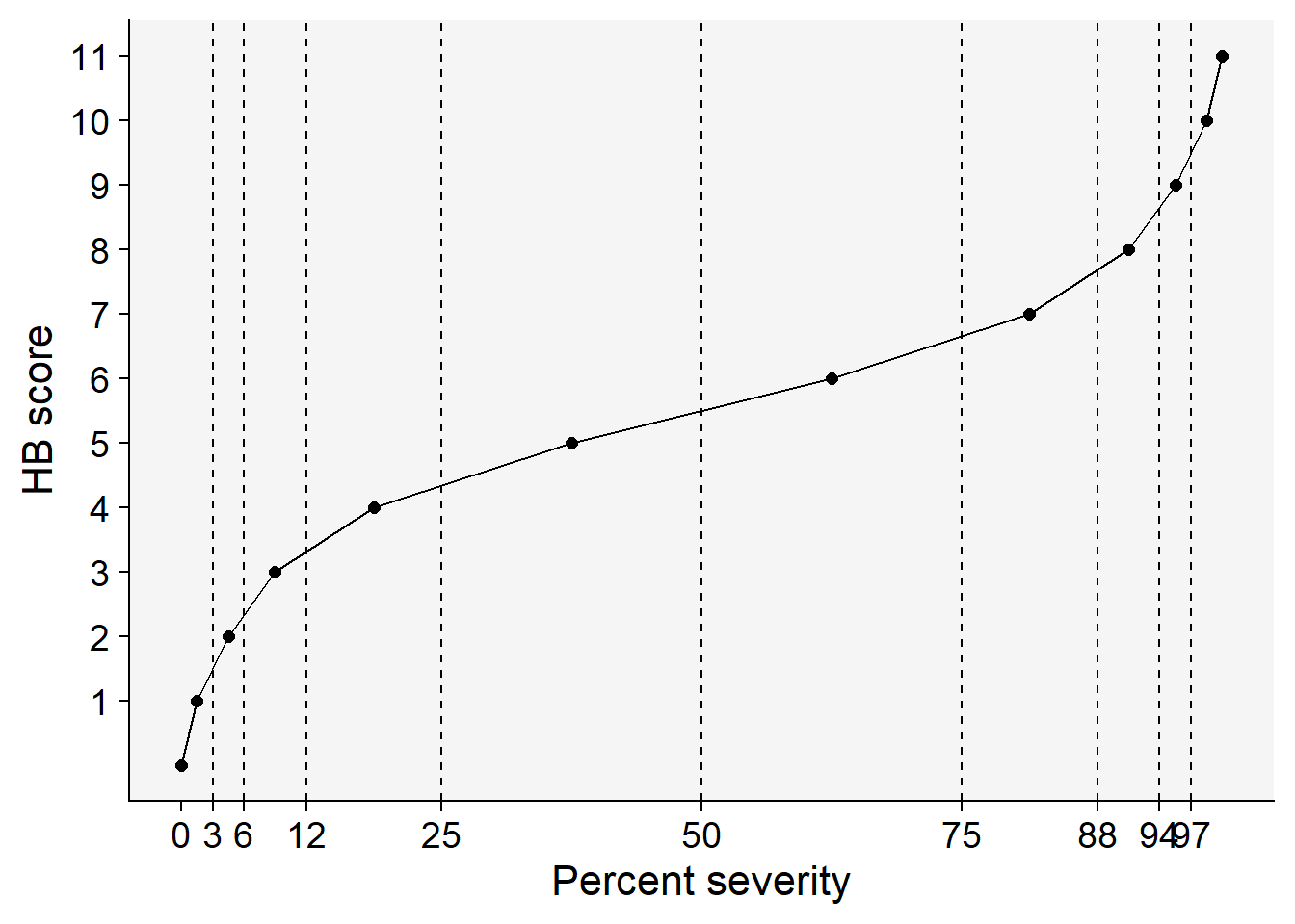
HB <- tibble::tribble(
  ~ordinal, ~'range', ~midpoint,
  0,          '0',    0,   
  1,    '0+ to 3',  1.5,   
  2,    '3+ to 6',  4.5,   
  3,   '6+ to 12',  9.0,  
  4,  '12+ to 25', 18.5, 
  5,  '25+ to 50', 37.5, 
  6,  '50+ to 75', 62.5, 
  7,  '75+ to 88', 81.5, 
  8,  '88+ to 94', 91.0, 
  9,  '94+ to 97', 95.5, 
  10,'97+ to 100', 98.5,  
  11,      '100',   100 
  )
knitr::kable(HB, align = "c")
Table 3.1: The Horsfal-Barrat quantitative ordinal scale used as a tool for assessing plant disease severity
ordinal range midpoint
0 0 0.0
1 0+ to 3 1.5
2 3+ to 6 4.5
3 6+ to 12 9.0
4 12+ to 25 18.5
5 25+ to 50 37.5
6 50+ to 75 62.5
7 75+ to 88 81.5
8 88+ to 94 91.0
9 94+ to 97 95.5
10 97+ to 100 98.5
11 100 100.0

Let’s visualize the different sizes of the percent interval encompassing each score.

Code
library(tidyverse)
library(r4pde)
HB |> 
  ggplot(aes(midpoint, ordinal))+
  geom_point(size =2)+
  geom_line()+
  scale_x_continuous(breaks = c(0, 3, 6, 12, 25, 50, 75, 88, 94, 97))+
  scale_y_continuous(breaks = c(1:12))+
  geom_vline(aes(xintercept = 3), linetype = 2)+
  geom_vline(aes(xintercept = 6), linetype = 2)+
  geom_vline(aes(xintercept = 12), linetype = 2)+
  geom_vline(aes(xintercept = 25), linetype = 2)+
  geom_vline(aes(xintercept = 50), linetype = 2)+
  geom_vline(aes(xintercept = 75), linetype = 2)+
  geom_vline(aes(xintercept = 88), linetype = 2)+
  geom_vline(aes(xintercept = 94), linetype = 2)+
  geom_vline(aes(xintercept = 97), linetype = 2)+
  labs(x = "Percent severity", y = "HB score")+
  theme_r4pde()

Figure 3.1: Ordinal scores of the Horsfal-Barrat scale

We can repeat those procedures to visualize the Chiang scale.

chiang <- tibble::tribble(
  ~ordinal, ~'range', ~midpoint,
  0,          '0',     0,   
  1,  '0+ to 0.1',  0.05,   
  2,'0.1+ to 0.5',   0.3,   
  3,  '0.5+ to 1',  0.75,  
  4,    '1+ to 2',   1.5, 
  5,    '2+ to 5',     3, 
  6,   '5+ to 10',   7.5, 
  7,  '10+ to 20',    15, 
  8,  '20+ to 30',    25, 
  9,  '30+ to 40',    35, 
  10, '40+ to 50',    45,  
  11, '50+ to 60',    55,
  12, '60+ to 70',    65,
  13, '70+ to 80',    75,
  14, '80+ to 90',    85,
  15,'90+ to 100',   95
  )
knitr::kable(chiang, align = "c")
Table 3.2: The Chiang quantitative ordinal scale used as a tool for assessing plant disease severity
ordinal range midpoint
0 0 0.00
1 0+ to 0.1 0.05
2 0.1+ to 0.5 0.30
3 0.5+ to 1 0.75
4 1+ to 2 1.50
5 2+ to 5 3.00
6 5+ to 10 7.50
7 10+ to 20 15.00
8 20+ to 30 25.00
9 30+ to 40 35.00
10 40+ to 50 45.00
11 50+ to 60 55.00
12 60+ to 70 65.00
13 70+ to 80 75.00
14 80+ to 90 85.00
15 90+ to 100 95.00
chiang |> 
  ggplot(aes(midpoint, ordinal))+
  geom_point(size =2)+
  geom_line()+
  scale_y_continuous(breaks = c(0:15))+
  scale_x_continuous(breaks = c(0, 5, 10, 20, 30, 40, 50, 60, 70, 80, 90, 100))+
  geom_vline(aes(xintercept = 0), linetype = 2)+
  geom_vline(aes(xintercept = 0.1), linetype = 2)+
  geom_vline(aes(xintercept = 0.5), linetype = 2)+
  geom_vline(aes(xintercept = 1), linetype = 2)+
  geom_vline(aes(xintercept = 2), linetype = 2)+
  geom_vline(aes(xintercept = 5), linetype = 2)+
  geom_vline(aes(xintercept = 10), linetype = 2)+
  geom_vline(aes(xintercept = 20), linetype = 2)+
  geom_vline(aes(xintercept = 30), linetype = 2)+
   geom_vline(aes(xintercept = 40), linetype = 2)+
   geom_vline(aes(xintercept = 50), linetype = 2)+
   geom_vline(aes(xintercept = 60), linetype = 2)+
   geom_vline(aes(xintercept = 70), linetype = 2)+
   geom_vline(aes(xintercept = 80), linetype = 2)+
   geom_vline(aes(xintercept = 90), linetype = 2)+
   geom_vline(aes(xintercept = 100), linetype = 2)+
  labs(x = "Percent severity", y = "Chiang score")+
  theme_r4pde()

Figure 3.2: Ordinal scores of the Chiang scale

3.1.2 Qualitative ordinal

In the qualitative ordinal scale, each class provides a description of the symptoms. An example is the ordinal 0-3 scale for rating eyespot of wheat developed by (Scott and Hollins 1974).

Ordinal scale for rating eyespot of wheat (Scott and Hollins 1974)
Class Description
0 uninfected
1 slight eyespot (or or more small lesion occupying in total less than half of the circumference of the stem)
2 moderate eyespot (one or more lesions occupying at least half the circumference of the stem)
3 severe eyespot (stem completely girdled by lesions; tissue softened so that lodging would really occur)

3.2 Disease severity index (DSI)

Sometimes, when quantitative or qualitative ordinal scales are used, the scores given to various individual specimens (the observational units) are transformed into an index on a percentage basis, such as the disease severity index (DSI) which is used as a value for the experimental unit further in data analysis. The DSI is a single number that summarizes a large amount of information on disease severity (Chester 1950). The formula for a DSI (%) can be written as follows:

\(DSI = \frac{∑(class \ freq. \ ✕ \ score \ of \ class)} {total \ n \ ✕ \ maximal \ class} ✕ 100\)

The DSI() and DSI2() are part of the r4pde package. Let’s see how each function works.

The DSI() allows to automate the calculation of the disease severity index (DSI) in a series of units (e.g. leaves) that are further classified according to ordinal scores. The function requires three arguments:

  • unit = the vector of the number of each unit

  • class = the vector of the scores for the units

  • max = the maximum value of the scale

Let’s create a toy data set composed of 12 units where each received an ordinal score. The vectors were arranged as a data frame named scores.

unit <- c(1:12)
class <- c(2,3,1,1,3,4,5,0,2,5,2,1)
ratings <- data.frame(unit, class)
knitr::kable(ratings)
unit class
1 2
2 3
3 1
4 1
5 3
6 4
7 5
8 0
9 2
10 5
11 2
12 1

The ordinal score used in this example has 6 as the maximum score. The function returns the DSI value.

library(r4pde)
DSI(ratings$unit, ratings$class, 6)
[1] 40.27778

Let’s now deal with a situation of multiple plots (five replicates) where a fixed number of 12 samples were taken and assessed using an ordinal score. Let’s input the data using the tribble() function. Note that the data is in the wide format.

exp <- tibble::tribble(
  ~rep, ~`1`, ~`2`, ~`3`, ~`4`, ~`5`, ~`6`, ~`7`, ~`8`, ~`9`, ~`10`, ~`11`,~`12`,
  1, 2, 3, 1, 1, 3, 4, 5, 0, 2, 5, 2, 1,
  2, 3, 4, 4, 6, 5, 4, 4, 0, 2, 1, 1, 5,
  3, 5, 6, 6, 5, 4, 2, 0, 0, 0, 0, 2, 0,
  4, 5, 6, 0, 0, 0, 3, 3, 2, 1, 0, 2, 3, 
  5, 0, 0, 0, 0, 2, 3, 2, 5, 6, 2, 1, 0,
)
knitr::kable(exp)
rep 1 2 3 4 5 6 7 8 9 10 11 12
1 2 3 1 1 3 4 5 0 2 5 2 1
2 3 4 4 6 5 4 4 0 2 1 1 5
3 5 6 6 5 4 2 0 0 0 0 2 0
4 5 6 0 0 0 3 3 2 1 0 2 3
5 0 0 0 0 2 3 2 5 6 2 1 0

After reshaping the data to the long format, we can calculate the DSI for each plot/replicate as follows:

res <- exp |> 
  pivot_longer(2:13, names_to = "unit", values_to = "class") |>
  group_by(rep) |> 
  summarise(DSI = DSI(unit, class, 6))

And here we have the results of the DSI for each replicate.

knitr::kable(res, align = "c")
rep DSI
1 40.27778
2 54.16667
3 41.66667
4 34.72222
5 29.16667

Now our data set is organized as the frequency of each class as follows:

ratings2 <- ratings |> 
  dplyr::count(class)

ratings2
  class n
1     0 1
2     1 3
3     2 3
4     3 2
5     4 1
6     5 2

Now we can apply the DSI2() function. The function requires three arguments:

  • class = the number of the respective class
  • freq = the frequency of the class
  • max = the maximum value of the scale
library(r4pde)
DSI2(ratings2$class, ratings2$n, 6)
[1] 40.27778

3.3 Analysis of ordinal data

Ordinal score data typically do not align well with the assumptions of traditional parametric statistical methods. Given this challenge, non-parametric methods have emerged as a compelling alternative for handling ordinal plant pathological data (Shah and Madden 2004). Unlike their parametric counterparts, these methods do not rest on the presumption of a specific distribution for the underlying population, offering greater flexibility in accommodating the intricacies inherent to ordinal data. On the other hand, when the conditions are right, parametric methods can also be harnessed effectively.

A common strategy, particularly for ordinal scores, involves converting these values into the mid-points of their corresponding percent scales. This transformation renders the data more amenable to parametric analyses. However, the mid-point conversion has been criticized in the literature as it may amplify the imprecision, especially when the interval size is wide, and because it does not really reflect a true value, but an interval for each estimate (Chiang et al. 2023; Onofri et al. 2018).

Let’s see some examples of analysis using the mid-point conversion in a parametric framework as well as the non-parametric tests.

3.3.1 Example data

We will use a data set made available in an article on the application of the survival analysis technique to test hypotheses when using quantitative ordinal scales (Chiang et al. 2023). The data and codes used in the paper can be found in the specified GitHub repository. The data is structured into four treatments, each with 30 ratings ranging from a score of 1 to 6 on the H-B scale.

# Create the vectors for the treatments
trAs <- c(5,4,2,5,5,4,4,2,5,2,2,3,4,3,2,
          2,6,2,2,4,2,4,2,4,5,3,4,2,2,3)
trBs <- c(5,3,2,4,4,5,4,5,4,4,6,4,5,5,5,
          2,6,2,3,5,2,6,4,3,2,5,3,5,4,5)
trCs <- c(2,3,1,4,1,1,4,1,1,3,2,1,4,1,1,
          2,5,2,1,3,1,4,2,2,2,4,2,3,2,2)
trDs <- c(5,5,4,5,5,6,6,4,6,4,3,5,5,6,4,
          6,5,6,5,4,5,5,5,3,5,6,5,5,5,6)

# Create the tibble
dat_ordinal <- tibble::tibble(
  treatment = rep(c("A", "B", "C", "D"), 
                  each = 30),
  score = c(trAs, trBs, trCs, trDs)
)

dat_ordinal
# A tibble: 120 × 2
   treatment score
   <chr>     <dbl>
 1 A             5
 2 A             4
 3 A             2
 4 A             5
 5 A             5
 6 A             4
 7 A             4
 8 A             2
 9 A             5
10 A             2
# ℹ 110 more rows

Because the ordinal response was obtained using an interval scale, the mid-point of the score was also obtained.

# Create the vectors for the treatments
trAm <- c(18.5,9,1.5,18.5,18.5,9,9,1.5,
          18.5,1.5,1.5,4.5,9,4.5,1.5,1.5,
          37.5,1.5,1.5,9,1.5,9,1.5,9,18.5,
          4.5,9,1.5,1.5,4.5)
trBm <- c(18.5,4.5,1.5,9,9,18.5,9,18.5,9,
          9,37.5,9,18.5,18.5,18.5,1.5,37.5,
          1.5, 4.5,18.5,1.5,37.5,9,4.5,1.5,
          18.5,4.5,18.5,9,18.5)
trCm <- c(1.5,4.5,0,9,0,0,9,0,0,4.5,1.5,0,9
          ,0,0,1.5,18.5,1.5,0,4.5,0,9,1.5,1.5,
          1.5,9,1.5,4.5,1.5,1.5)
trDm <- c(18.5,18.5,9,18.5,18.5,37.5,37.5,9,
          37.5,9,4.5,18.5,18.5,37.5,9,37.5,
       18.5,37.5,18.5,9,18.5,18.5,18.5,4.5,18.5,
       37.5,18.5,18.5,18.5,37.5)

# Create the tibble
dat_ordinal_mp <- tibble::tibble(
  treatment = rep(c("A", "B", "C", "D"), 
                  each = 30),
  midpoint = c(trAm, trBm, trCm, trDm)
)
dat_ordinal_mp
# A tibble: 120 × 2
   treatment midpoint
   <chr>        <dbl>
 1 A             18.5
 2 A              9  
 3 A              1.5
 4 A             18.5
 5 A             18.5
 6 A              9  
 7 A              9  
 8 A              1.5
 9 A             18.5
10 A              1.5
# ℹ 110 more rows

The visualization using box-plots suggests differences between the treatments.

p_score <- dat_ordinal |> 
  ggplot(aes(treatment, score))+
  geom_boxplot(outlier.colour = NA)+
  geom_point()+
  theme_r4pde()

p_mp <- dat_ordinal_mp |> 
  ggplot(aes(treatment, midpoint))+
  geom_boxplot(outlier.colour = NA)+
  geom_point()+
  theme_r4pde()

library(patchwork)
p_score | p_mp

3.3.2 Parametric (mid-point conversion)

Parametric methods can be employed when analyzing data, provided that the underlying assumptions of these methods are satisfied. For data that is based on ordinal scores, one way to apply parametric methods is to convert these scores into the mid-points of their corresponding percent scales. Once converted, the data is better suited for parametric analyses. Among the available techniques, the most frequently utilized is the application of an ANOVA (Analysis of Variance) model. This model is particularly useful for testing the null hypothesis, which posits that there are no significant differences among the treatments being studied.

We can use the aov function to fit the model and check the parametric assumptions using the DHARMa package.

m1_mp <- aov(midpoint ~ treatment, data = dat_ordinal_mp)
# normality and homocedasticity tests
library(DHARMa)
plot(simulateResiduals(m1_mp))

Since both normality and homoscedasticity assumptions are violated in our initial model, we will halt further analysis using this model. Instead, we will explore an alternative approach that includes data transformation (logit).

# data transformation
library(car)
# transform midpoint to proportion
dat_ordinal_mp$midpoint2 <- dat_ordinal_mp$midpoint/100

m2_mp <- aov(logit(midpoint2) ~ treatment, data = dat_ordinal_mp)
plot(simulateResiduals(m2_mp)) # assumptions are met

Now that both assumptions have been met, we can proceed to use a means comparison test to determine which treatments differ from one another, with the assistance of the {emmeans} package. It’s important to note that the results are displayed in the original scale after transformation, specifically when using type = "response.

library(emmeans)
means_m2_mp <- emmeans(m2_mp, "treatment", type = "response")
means_m2_mp
 treatment response      SE  df lower.CL upper.CL
 A           0.0808 0.00983 116   0.0634   0.1026
 B           0.1248 0.01446 116   0.0989   0.1564
 C           0.0461 0.00582 116   0.0358   0.0591
 D           0.2071 0.02173 116   0.1674   0.2535

Confidence level used: 0.95 
Intervals are back-transformed from the logit scale 

The best way to visualize the differences between treatments is using the pwpm function to display a matrix of estimates, pairwise differences, and P values. Most commonly, the compact letter display is used for means comparison.

# matrix
pwpm(means_m2_mp)
         A        B        C        D
A [0.0808]   0.0530   0.0094   <.0001
B    0.617 [0.1248]   <.0001   0.0085
C    1.820    2.953 [0.0461]   <.0001
D    0.337    0.546    0.185 [0.2071]

Row and column labels: treatment
Upper triangle: P values   null = 1  adjust = "tukey"
Diagonal: [Estimates] (response)   type = "response"
Lower triangle: Comparisons (odds.ratio)   earlier vs. later
# compact letter display
library(multcomp)
cld(means_m2_mp)
 treatment response      SE  df lower.CL upper.CL .group
 C           0.0461 0.00582 116   0.0358   0.0591  1    
 A           0.0808 0.00983 116   0.0634   0.1026   2   
 B           0.1248 0.01446 116   0.0989   0.1564   2   
 D           0.2071 0.02173 116   0.1674   0.2535    3  

Confidence level used: 0.95 
Intervals are back-transformed from the logit scale 
P value adjustment: tukey method for comparing a family of 4 estimates 
Tests are performed on the log odds ratio scale 
significance level used: alpha = 0.05 
NOTE: Compact letter displays can be misleading
      because they show NON-findings rather than findings.
      Consider using 'pairs()', 'pwpp()', or 'pwpm()' instead. 

3.3.3 Non-parametric (ordinal score)

Because ordinal score data generally do not meet the assumptions of traditional parametric statistical methods, non-parametric methods can be considered as an alternative. Such methods have been proposed for analyzing ordinal data in plant pathology (Shah and Madden 2004). For our example, when more than two treatments are involved, a Kruskal-Wallis test can be utilized. The kruskal function of the {agricolae} package does the job we want. Note that in this case we use the ordinal score directly and not the mid-point value.

library(agricolae)
kruskal(dat_ordinal$score, dat_ordinal$treatment, console = TRUE)

Study: dat_ordinal$score ~ dat_ordinal$treatment
Kruskal-Wallis test's
Ties or no Ties

Critical Value: 52.34422
Degrees of freedom: 3
Pvalue Chisq  : 2.529543e-11 

dat_ordinal$treatment,  means of the ranks

  dat_ordinal.score  r
A          52.05000 30
B          69.58333 30
C          29.61667 30
D          90.75000 30

Post Hoc Analysis

t-Student: 1.980626
Alpha    : 0.05
Minimum Significant Difference: 13.1991 

Treatments with the same letter are not significantly different.

  dat_ordinal$score groups
D          90.75000      a
B          69.58333      b
A          52.05000      c
C          29.61667      d

3.3.4 Survival analysis

A method based on survival analysis was more recently introduced for the analysis of ordinal data (Chiang et al. 2023). The authors developed an R script called “CompMuCens”, which facilitates the comparison of multiple treatment means for plant disease severity data. This is achieved through nonparametric survival analysis using class- or interval-based data derived from a quantitative ordinal scale. The code is accessible in this repository and has been incorporated into the {r4pde} package.

We continue with our working example data. Since the expected variable name for the score in the function is x, we must adjust our data frame accordingly.

names(dat_ordinal) <- c("treatment", "x")

The CompMuCens() function uses the ictest() from the {interval} package to conduct nonparametric survival analysis. Detailed explanation of the function’s input and output can be found here. We just need to set the dat and the scale arguments. The scale will be used to convert the scores in to the defined interval which is used as response variable in the analysis. For example, if the score is 2, the respective limits of the interval will be 3 and 6. For 7, the limits will be 75 and 88. The function takes care of this conversion based on the inputted scale values.

library(interval)
library(r4pde)

scale <- c(0,3,6,12,25,50,75,88,94,97,100, 100)
CompMuCens(dat_ordinal, scale)
$U.Score
  treatment      score
1         D -15.125000
2         B  -4.541667
3         A   4.225000
4         C  15.441667

$Hypothesis.test
  treat1 treat2 p-value for H0: treat1 ≤ treat2 p-value for H0: treat1 = treat2
1      D      B                    0.0018767018                              NA
2      B      A                    0.0113215174                              NA
3      A      C                    0.0007456484                              NA

$adj.Signif
[1] 0.01666667

$Conclusion
[1] "D>B>A>C"

The outcomes are three: the ordered scores for each treatment, the pairwise comparison between treatments and the significance levels, followed by a conclusion section. In this example all treatments differ from each other.

3.3.5 Interpretation

Upon comparing the three methods, it becomes evident that there is a marked distinction in their outcomes. The Kruskal-Wallis and the survival analysis tests suggested a significant difference between treatment A and B, whereas the parametric counterpart did not. However, it’s crucial to note that the P-value is borderline significant at 0.0530, being just slightly above the conventional threshold of 0.05. Given this, it appears that the conversion to the mid-point might have resulted in a type II error, wherein a genuine difference between the treatments might have been missed or overlooked. A detailed comparison between the mid-point and survival analysis has been presented in the paper, which is worth a reading (Chiang et al. 2023)